In July 2008 Michael Ventnor implemented the CSS property box-shadow in Mozilla (as -moz-box-shadow, until the spec has stabilized). In this post I’d like to give a quick summary of how box shadows work. I’ve created a little demo page; all the shadows you see in this post are screenshots from that page. Use a recent nightly Firefox build to view it.
Overview
The most basic way of setting a box shadow on a box is using box-shadow: [x offset] [y offset] [color]:
box-shadow: 5px 3px black;
Adding another number lets you specify a blur radius:
box-shadow: 3px 3px 5px black;
You can even set a spread radius (this extends the shadow rect):

box-shadow: 0 0 5px 5px black;
Negative spread values are possible, too:
box-shadow: 0 5px 5px -3px black;
Another interesting feature is the ability to set multiple box shadows, separated by comma, starting with the topmost shadow:
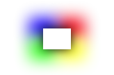
box-shadow:
  0 0 20px black,
  20px 15px 30px yellow,
  -20px 15px 30px lime,
  -20px -15px 30px blue,
  20px -15px 30px red;
Shadow Opacity
What if you’d like the shadow to be more transparent? Just use the rgba syntax when setting the color and specify an appropriate alpha value:
box-shadow: 3px 3px 5px rgba(0, 0, 0, 0.5);
Increasing the opacity of a shadow is slightly more tricky. First you should try playing with the spread radius, but if that doesn’t give the right results, duplicating the shadow layer works, too:
box-shadow: 3px 3px 5px black, 3px 3px 5px black;
Inset Box Shadows
Finally I’m getting to the reason I’m writing this blog post in the first place. Just over a week ago, Michael Ventnor added support for inset box shadows.
Using inset box shadows is as simple as adding the inset keyword to a box shadow layer.
box-shadow: inset 2px 2px 5px black;
Inset and outset shadows can be combined:
box-shadow: inset 2px 2px 5px black, 2px 2px 5px black;
Now the usefulness of multiple shadow layers becomes really apparent. You can use inset box shadows to create gradients, highlights, 3D borders etc. and freely stack them on top of each other. It’s just like using an unlimited number of “inner shadow” layer styles in Photoshop!
In combination with border-radius (which can even be elliptical in Firefox 3.5), the possibilities for creating shiny, image-less buttons are endless. For example, this is a recreated version of the button on getmiro.com:


The CSS code for buttons like this one can quickly become complicated, though… it’s all on the demo page, in case you’re interested.
More Examples
Recreating Cocoa controls with box shadow (and without any images) is fun, too:
| Searchfields: |  |
| Aqua buttons: |   |
| “Recessed” Cocoa buttons: |  |
| “Round textured” Cocoa buttons: |  |
Adapting To The Background Color
Inset box shadows are painted on top of the background layer. Black inset shadows make the background darker, white shadows make it lighter. If you keep that in mind, you can build box shadow constructs that can adapt to arbitrary backgrounds. I experimented a little and came up with super glossy boxes that look a little like Cocoa select boxes:

(See how the saturation is higher in the lower half of each box? 🙂 )
Browser Support
As far as I know, Webkit was the first engine to implement support for box shadows. A basic form has been supported since the version that Safari 3 ships with, and support for spread radii and inset box shadows was added in July 2009. Consequently, recent versions of Chrome can do all these things, too. In Webkit the property is called -webkit-box-shadow.
Firefox supports box shadows starting with version 3.5 under the name -moz-box-shadow.
Good news for Opera users: The recently released Opera 10.5 pre-alpha now supports box shadows, too! There are still some obvious bugs (e.g. box shadows with a zero blur radius sometimes aren’t painted), but I’m sure they’ll get fixed in time for the final release.
It’s interesting to note that Opera doesn’t use a vendor prefix in their box-shadow property name. Webkit also did this at some point but later re-introduced the -webkit- prefix since the box shadow section has been removed from the CSS 3 Backgrounds and Borders specification.
Notes
You should keep in mind that box shadows are rendered on the fly whenever your boxes are repainted. Some performance improvements have already been made, but drawing box shadows is still expensive. So if you value rendering speed and need shadows for large boxes (or shadows with large blur values), you should definitely consider using images of “pre-computed” shadows instead (for example as border-images).
Finally, I’d like to thank Michael for implementing this stuff in Firefox, and David Baron and Robert O’Callahan for reviewing his patches – thanks!
Update 2009-04-08: dbaron approved the inset box shadow patch for 1.9.1 after all, and today I landed it – that means we’ll get inset box shadows in Firefox 3.5! I’ve updated the article accordingly.
Update 2010-01-21: Updated the browser compatibility section since Webkit and the new Opera pre-alpha now support box-shadows.
 Markus Stange's Blog